1. Brand Architecture
2. Link Previews
3. Sticker Scans
4. Campus Reports
Marriage Pact
hello@marriagepact.com
Brand Architecture
2020
Designers:
Oscar Dumlao
Marc Liu
Oscar Dumlao
Marc Liu

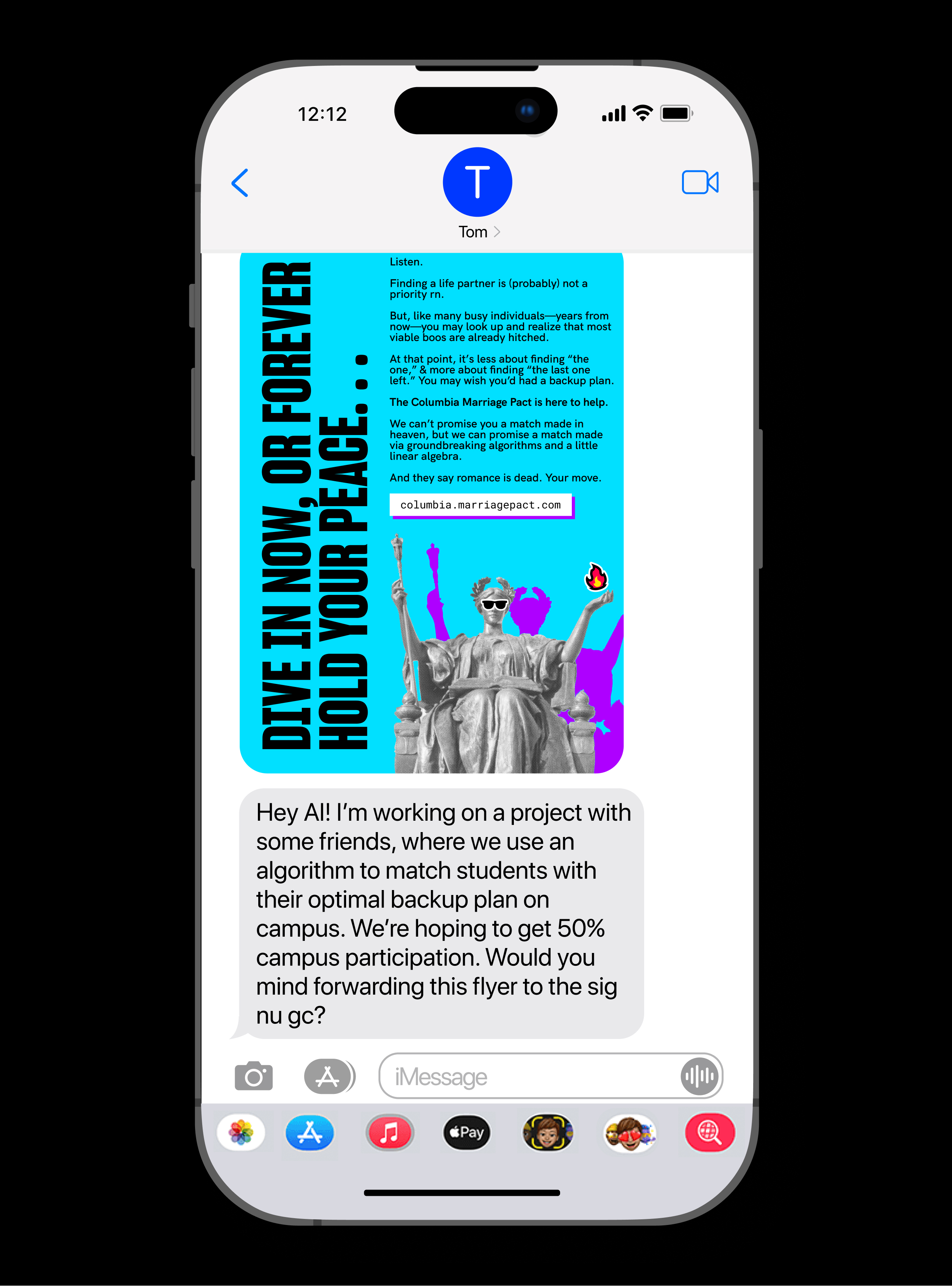
For Marriage Pact’s inaugural brand, our goal was to craft something at the intersection of data, romance, and fate. We also sought out the bold, flat colors of pop art—we wanted our graphic design to be eye-catching any time and anywhere it appeared on campus.
One central challenge was designing a single cohesive brand, yet one that could localize well at any college campus. We wanted each Marriage Pact to proudly represent that particular school’s experience, and make sense on its own, without needing any broader context.
One central challenge was designing a single cohesive brand, yet one that could localize well at any college campus. We wanted each Marriage Pact to proudly represent that particular school’s experience, and make sense on its own, without needing any broader context.
 Global logo vs. local school logo
Our brand architecture decomposes into two levels: The global brand can represent the Marriage Pact independent of any particular college campus. The local brand can serve each particular school community, honoring that particular campus.
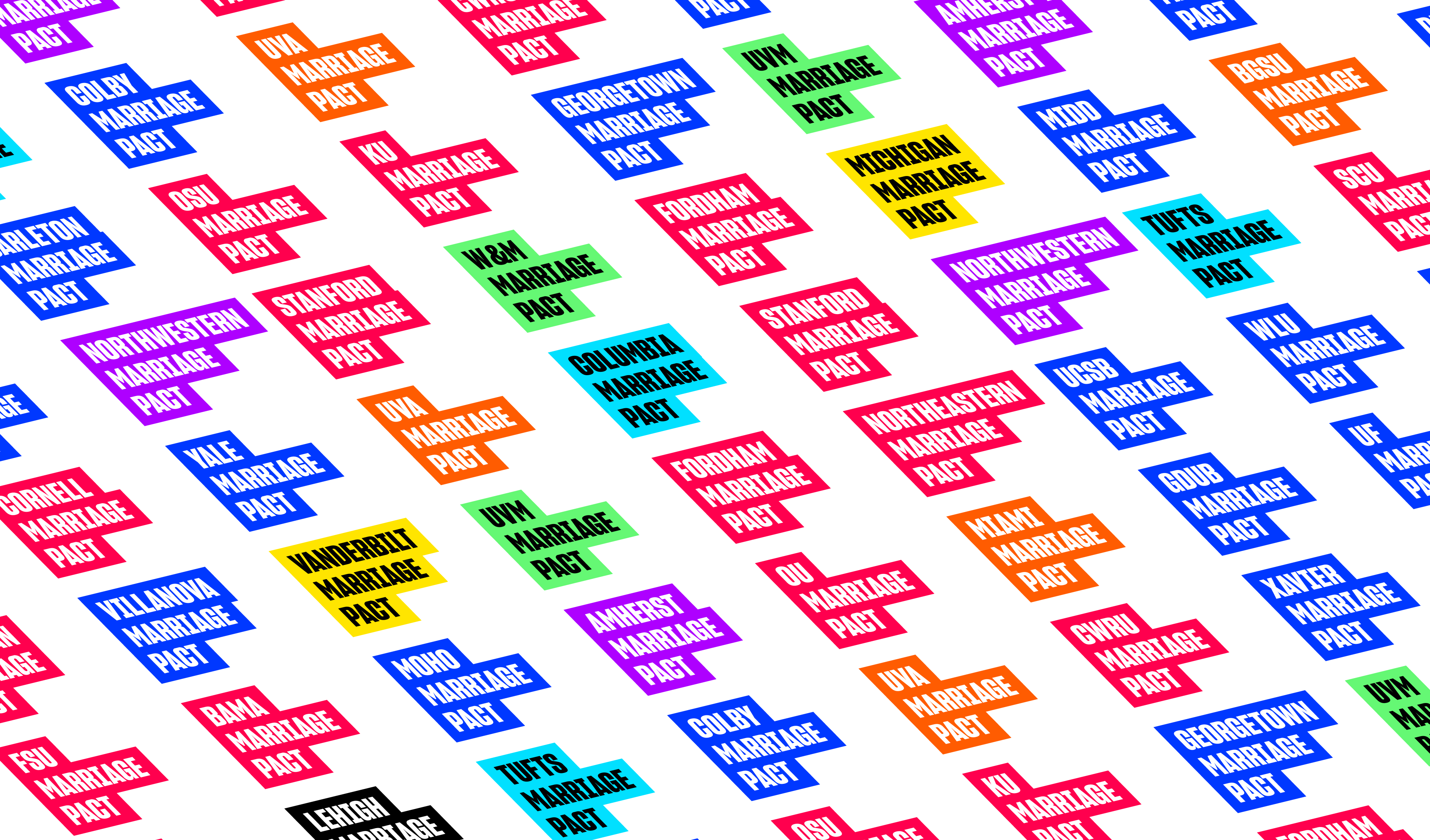 Variation of school logos
Our global logo is simple, distinctive, and flexible enough to provide the foundation for the rest of our visual language. It contains our company name, “Marriage Pact”, in two black blocks proportional to each word. Local logos expand on the global logo by adding a third-story to contain the colloquial name of a university. These marks are created by following the same construction principles as the global logo.
 Color palette exploration
To give our identity the flexibility to represent any university that might launch a marriage pact tradition, we adopted seven colors. The dominance of the given color at each particular school both localizes the event and evokes a bold, young, and energetic feeling.
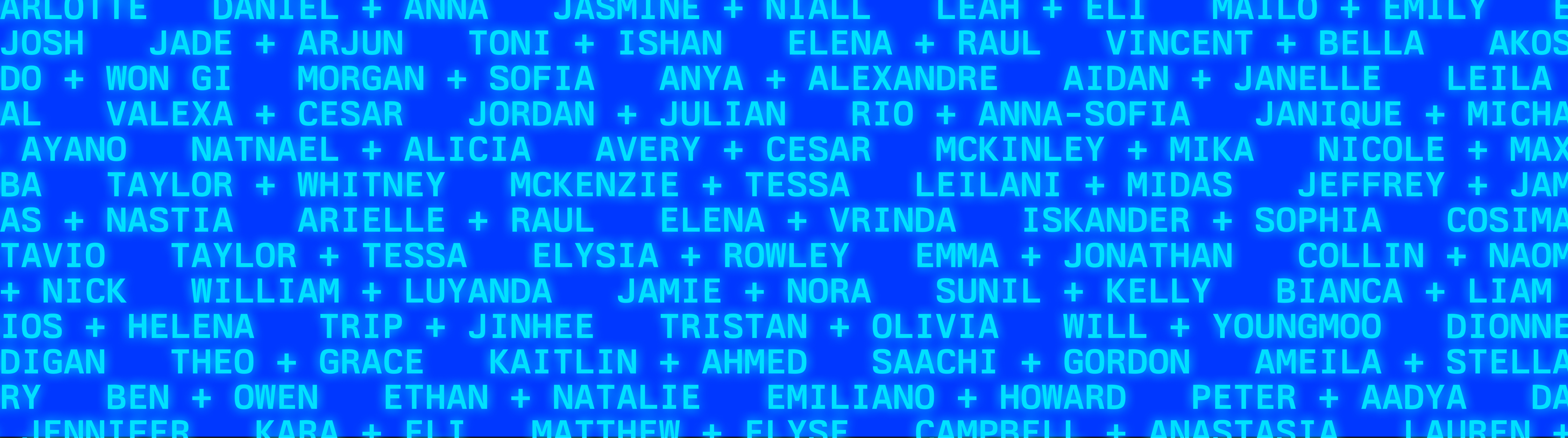 Brand pattern set to Berkeley Mono
 A second challenge for our brand architecture: communicating the spirit and credibility of the algorithm. Many algorithm-driven products let users feel the quality of the algorithm through repeated, long-term interaction. But the Marriage Pact provides users with just one match. It’s up to our visual brand to communicate to each user just how credible the algorithm is.
 Sample spreads of our brand guidelines
Every aspect of the brand identity is considered with this in mind. For example, for each of our seven brand colors, we selected vivid hues from digital-only corners of the color gamut. In our font choices, we selected Berkeley Mono for accents, text-based textures, data graphics, and the like, as it synthesizes the best of ‘70s computer typefaces. HK Grotesk, our mono type, evokes the validity of the algorithm, and alludes to the computational way the Marriage Pact solves otherwise very human problems.